The Story Behind Our Signature Colors


Colors are not just visual choices—they are symbols. They hold meaning, evoke emotion, and shape the way we feel in a space. At The Quiet Temple, we believe color is part of the language of peace. From the very beginning, our brand was designed to be more than a boutique; it was meant to be a sanctuary. And the palette we chose reflects that sanctuary in every way.
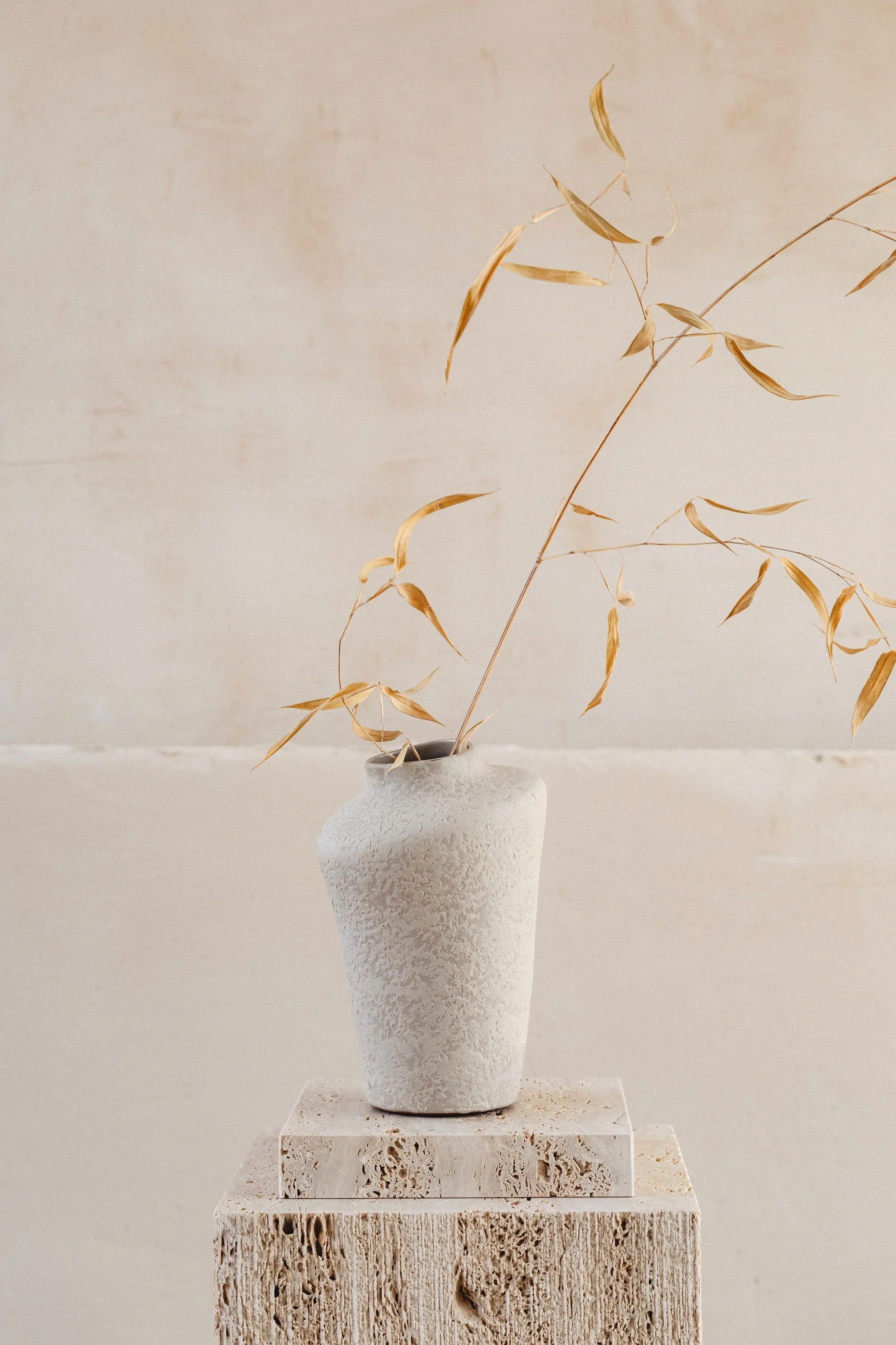
Our four signature colors—cream, sage green, gold, and beige—were carefully selected to represent the heart of our vision: a life of quiet luxury, intentional living, and spiritual grounding.
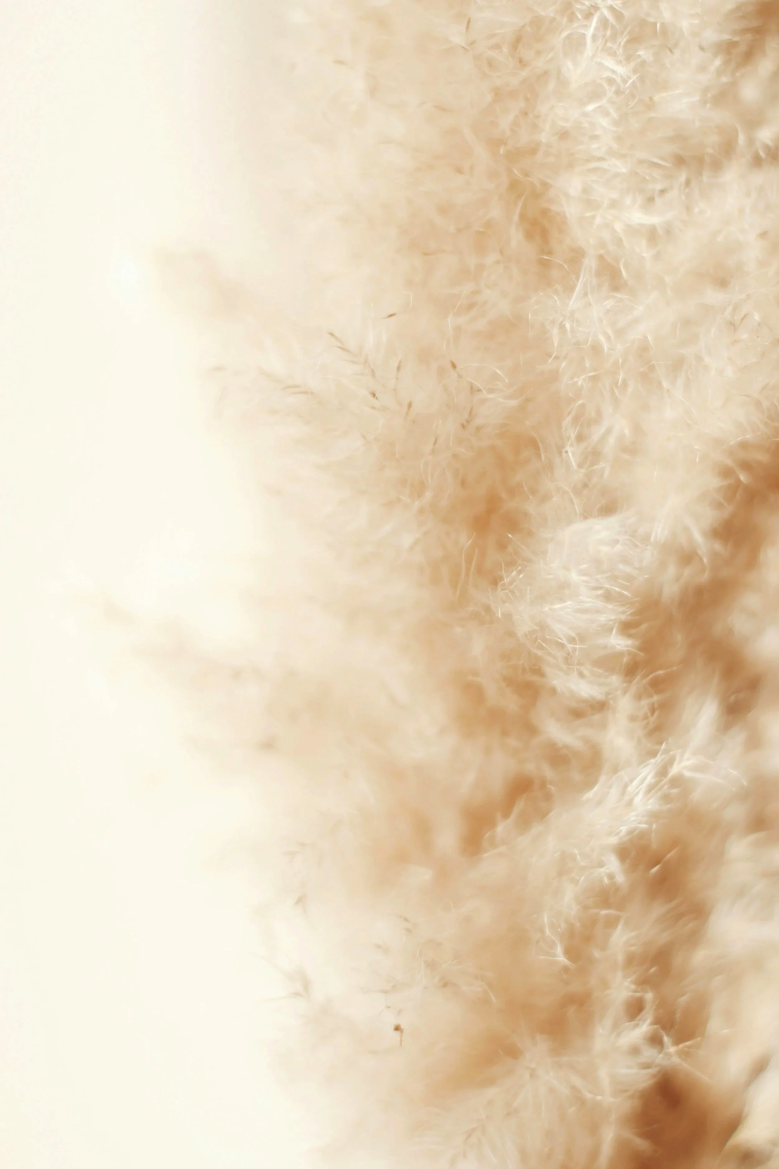
Cream: Purity and Peace
Cream is the foundation of our palette—a soft, neutral shade that speaks of purity, clarity, and stillness. It represents a blank page, a fresh start, a moment of silence before the day begins.
When you see cream in our journals, mugs, or robes, it’s an invitation to breathe and to enter a space of calm. It’s the color of renewal—the reminder that each day offers a new chance to write, reflect, and create peace within.
Sage Green: Growth and Renewal
Sage green is the grounding force of The Quiet Temple. It represents growth, balance, and harmony with nature. The color sage has long been associated with healing and wisdom, making it the perfect symbol for intentional living.
In our collections, sage green appears as a reminder that we are always growing. Whether it’s through journaling, prayer, or quiet reflection, sage calls us to stay rooted while reaching upward toward renewal.
Gold: Elegance and Divine Luxury
Gold is where quiet luxury meets divine elegance. For centuries, gold has been a symbol of royalty, value, and timeless beauty. In our palette, gold reminds us that true luxury is not loud—it is subtle, enduring, and deeply meaningful.
The gold details in our robes, journals, and candle labels are not about excess. They are about elevating the everyday. They remind us that life itself is sacred, and that treating daily moments with honor and beauty is a form of worship.
Beige: Stability and Warmth
Beige is the grounding element of our palette. It represents stability, comfort, and a sense of belonging. Beige is the soil in which peace grows; it’s warm, calming, and always present.
In The Quiet Temple collections, beige offers balance. It softens the brightness of gold, complements the freshness of sage, and harmonizes with the purity of cream. It is the steady base that reminds us that peace is not fragile—it is strong, rooted, and ever-present.
Living in Color: The Quiet Temple Way
Together, cream, sage, gold, and beige form more than a palette—they form a lifestyle. These colors appear across every product and collection not just for design consistency, but to carry a message:
Purity of mind (cream).
Growth of spirit (sage).
Elegance of luxury (gold).
Stability of life (beige).
When you bring these colors into your home, your rituals, and your daily practices, you are creating your own temple—a sanctuary that reflects both beauty and intention.